
In this post I’ll show you how to:
- Create a basic scatterplot for examining the relationship between two variables.
- Add a lowess smoother to a scatterplot to help visualize the relationship between two variables.
- Create a histogram to look at your data.
Basic Scatterplots
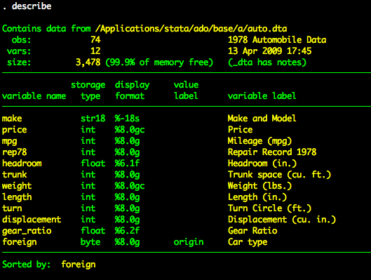
In this post we’ll use the auto dataset.
sysuse auto, clear
Creating a Scatterplot
Creating scatterplots is easy in Stata. We’ll use the graph twoway scatter command (we can just type scatter but I like to use the graph twoway syntax to make things more consistent across graph types. We’ll visualize the relationship between price and length. When using graph twoway scatter we first list the variable that we want on the y-axis and then the variable we want on the x-axis. We’ll also add a title to the graph.
graph twoway scatter price length, title("Scatterplot of price and length")

Adding a Lowess Smoother
Adding the lowess smoother is easy as well. To do this we are going to append two graph twoway plots. Specifically, we are going to append scatter and lowess. We append two plots by using double-pipes — ||. The pipe is found on the key directly above return or enter on most keyboards (you need to hold shift).
So to get the scatterplot of price and length with a lowess smoother, we type:
graph twoway scatter price length || lowess price length, title("Scatterplot of price and length")

Histograms
You can also use a histogram to look at your data. To create a histogram using drop-down menus, you will go to Graphics -> Histogram. In this dialogue box you need to specify which variable you are looking at in the “Variable” box. You can make any other changes or specifications you need within this window. For example, if I wanted to create a histogram of price, with the y-axis reflecting frequency, I would enter “price” in the “Variable” box and click on the “Frequency” option under the Y axis.

To create a histogram using commands, just type “histogram (your variable).” For example, to look at miles per gallon, you would type:
histogram mpg

Often the default settings of the histogram may not be the best representation of your data. There are a number of useful options with the histogram command, including width with allows you to specify bin width, frequency which changes the y-axis to reflect frequency instead of density and normal which overlays a normal curve onto your graphic. You can also modify the title and axes of the graph using syntax options.
histogram mpg, width(2) frequency normal title(mpg histogram)

